Calligraphy
Background to the schools Wikipedia
SOS Children offer a complete download of this selection for schools for use on schools intranets. SOS Children has looked after children in Africa for forty years. Can you help their work in Africa?
Calligraphy (from Greek κάλλος kallos "beauty" + γραφή graphẽ "writing") is a type of visual art. It is often called the art of fancy lettering (Mediavilla 1996: 17). A contemporary definition of calligraphic practice is "the art of giving form to signs in an expressive, harmonious and skillful manner" (Mediavilla 1996: 18). The story of writing is one of aesthetic evolution framed within the technical skills, transmission speed(s) and material limitations of a person, time and place (Diringer 1968: 441). A style of writing is described as a script, hand or alphabet (Fraser and Kwiatkowski 2006; Johnston 1909: Plate 6).
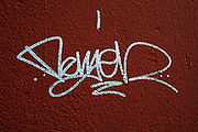
Modern calligraphy ranges from functional hand-lettered inscriptions and designs to fine-art pieces where the abstract expression of the handwritten mark may or may not compromise the legibility of the letters (Mediavilla 1996). Classical calligraphy differs from typography and non-classical hand-lettering, though a calligrapher may create all of these; characters are historically disciplined yet fluid and spontaneous, improvised at the moment of writing (Pott 2006 and 2005; Zapf 2007 and 2006).
Calligraphy continues to flourish in the forms of wedding and event invitations, font design/ typography, original hand-lettered logo design, religious art, announcements/ graphic design/commissioned calligraphic art, cut stone inscriptions and memorial documents. It is also used for props and moving images for film and television, testimonials, birth and death certificates, maps, and other works involving writing (see for example Letter Arts Review; Propfe 2005; Geddes and Dion 2004). Some of the finest works of modern calligraphy are charters and letters patent issued by monarchs and officers of state in various countries.
Western calligraphy
Tools and techniques
- Tools
The principal tools for a calligrapher are the pen, which may be flat-balled or round-nibbed, and the brush (Reaves and Schulte 2006; Child 1985; Lamb 1956). For some decorative purposes, multi-nibbed pens—steel brushes—can be used. However, works have also been made with felt-tip and ballpoint pens, although these works do not employ angled lines. Ink for writing is usually water-based and much less viscous than the oil based inks used in printing. High quality paper, which has good consistency of porosity, will enable cleaner lines, although parchment or vellum is often used, as a knife can be used to erase work on them and a light box is not needed to allow lines to pass through it. In addition, light boxes and templates are used to achieve straight lines without pencil markings detracting from the work. Ruled paper, either for a light box or direct use, is most often ruled every quarter or half inch, although inch spaces are occasionally used, such as with litterea unciales (hence the name), and college ruled paper acts as a guideline often as well.
Pens may be obtained from various stationery sources - from the traditional "nib" pens dipped in ink, to calligraphy pens that have cartridges built-in, avoiding the need to have to continually dip them into inkwells.
- Styles & techniques
Sacred Western calligraphy has some special features, such as the illumination of the first letter of each book or chapter in medieval times. A decorative "carpet page" may precede the literature, filled with ornate, geometrical depictions of bold-hued animals. The Lindisfarne Gospels (715-720 AD) are an early example (Brown 2004).
As with Chinese or Arabian calligraphies, Western calligraphic script had strict rules and shapes. Quality writing had a rhythm and regularity to the letters, with a "geometrical" order of the lines on the page. Each character had, and often still has, a precise stroke order.
Unlike a typeface, irregularity in the characters' size, style and colors adds meaning to the Greek translation "beautiful letters". The content may be completely illegible, but no less meaningful to a viewer with some empathy for the work on view. Many of the themes and variations of today's contemporary Western calligraphy are found in the pages of The Saint John's Bible. A particularly modern example is The Holy Bible, Timothy Botts Illustrated edition (Tyndale House Publishers 2000), with 360 calligraphic images as well as a calligraphy typeface.
Historical developments
Western calligraphy is recognizable by the use of the Roman alphabet, which evolved from the Phoenician, Greek, and Etruscan alphabets. The first Roman alphabet appeared about 600 BC, in Rome, and by the first century developed into Roman imperial capitals carved on stones, Rustic capitals painted on walls, and Roman cursive for daily use. In the second and third centuries the Uncial lettering style developed. As writing withdrew to monasteries, uncial script was found more suitable for copying the Bible and other religious texts. It was the monasteries which preserved calligraphic traditions during the fourth and fifth centuries, when the Roman Empire fell and Europe entered the Dark Ages.
At the height of the Roman Empire its power reached as far as Great Britain; when the empire fell, its literary influence remained. The Semi-uncial generated the Irish Semi-uncial, the small Anglo-Saxon. Each region seems to have developed its own standards following the main monastery of the region (i.e. Merovingian script, Laon script, Luxeuil script, Visigothic script, Beneventan script), which are mostly cursive and hardly readable.
The rising Carolingian Dynasty Empire encouraged a new standardized script, which was developed by several famous monasteries (including Corbie Abbey and Beauvais) around the eighth century. The script from Saint Martin of Tours was ultimately set as the Imperial standard, named the Carolingian script (or "the Caroline"). From the powerful Carolingian Empire, this standard also became used in neighboring kingdoms.
In the eleventh century, the Caroline evolved into the Gothic script, which was more compact and made it possible to fit more text on a page. The Gothic calligraphy styles became dominant throughout Europe; and in 1454, when Johannes Gutenberg developed the first printing press in Mainz, Germany, he adopted the Gothic style, making it the first typeface.
In the 15th century, the rediscovery of old Carolingian texts encouraged the creation of the Antiqua script (about 1470). The 17th century saw the Batarde script from France, and the 18th century saw the English script spread across Europe and world by their books.
The contemporary typefaces used by computers, from simple word processing programs like Microsoft Word or Apple Pages to professional designers' software packages like Adobe InDesign, owe a considerable debt to the past and to a small number of professional typeface designers today (Zapf 2007; Mediavilla 2006; Henning 2002).
Influences
Several other Western styles use the same tools and practices, but differ by the characters set, and by stylistic preferences. For Slavonic lettering, the history of the slavonic and consequently Russian writing systems differs fundamentally from the one of the Latin language. It evolved from the 10th century to today.
Eastern Asian calligraphy
|
Source
|
Names, tools and techniques
- Names
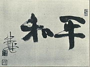
The local name for calligraphy is Shūfǎ 書法 in China, literally "The way/method/law of writing";, Shodō 書道 in Japan, literally "The way/principle of writing"; and Seoye (서예) 書藝 in Korea, literally "The art of writing". The calligraphy of East Asian characters is an important and appreciated aspect of East Asian culture.
- Tools
Traditional East Asian writing uses the Four Treasures of the Study (T: 文房四寶 / S: 文房四宝) : the ink brushes to write Chinese characters, Chinese ink, paper, and inkstone, know as the Four Friends of the Study (HG: 문방사우 / HJ: 文房四友) in Korea. In addition to these four tools, desk pads and paperweights are also used by calligraphers.
- Technique
The shape, size, stretch and hair type of the ink brush, the color, colour density and water density of the ink, as well as the paper's water absorption speed and surface texture are the main physical parameters influencing the final result. The calligrapher also influences the result by the quantity of ink/water he lets the brush take , then by the pressure, inclination, and direction he gives to the brush, producing thinner or bolder strokes, and smooth or toothed borders. Eventually, the speed, accelerations, decelerations of the writer's moves, turns, and crochets, and the stroke order give the "spirit" to the characters, by influencing greatly their final shapes.
Historical evolution
- Ancient China
In ancient China, the oldest Chinese characters existing are Jiǎgǔwén characters carved on ox scapula and tortoise plastrons,because the dominators in Shang Dynasty carved pits on such animals's bones and then baked them to gain auspice of military affairs ,agricultural harvest,or even procreating and weather,etc. During the divination ceremony, after the cracks were made, the characters were written with a brush on the shell or bone to be later carved.(Keightley, 1978). With the development of Jīnwén (Bronzeware script) and Dàzhuàn (Large Seal Script) "cursive" signs continued. Moreover, each archaic kingdom of current China had its own set of characters.
- Imperial China
In Imperial China, the graphs on old steles — some dating from 200 BC, and in Xiaozhuan style — are still accessible.
About 220 BC, the emperor Qin Shi Huang, the first to conquer the entire Chinese basin, imposed several reforms, among them Li Si's character unification, which created a set of 3300 standardized Xiǎozhuàn characters. Despite the fact that the main writing implement of the time was already the brush, few papers survive from this period, and the main examples of this style are on steles.
The Lìshū style (clerical script) which is more regularized, and in some ways similar to modern text, have been also authorised under Qin Shi Huangdi.
Kǎishū style (traditional regular script) — still in use today — and attributed to Wang Xizhi (王羲之, 303-361) and his followers, is even more regularized. Its spread was encouraged by Emperor Mingzong of Later Tang (926-933), who ordered the printing of the classics using new wooden blocks in Kaishu. Printing technologies here allowed a shape stabilization. The Kaishu shape of characters 1000 years ago was mostly similar to that at the end of Imperial China. But small changes have be made, for example in the shape of 广 which is not absolutely the same in the Kangxi Dictionary of 1716 as in modern books. The Kangxi and current shapes have tiny differences, while stroke order is still the same, according to old style.
Styles which did not survive include Bāfēnshū, a mix made of Xiaozhuan style at 80%, and Lishu at 20%. Some Variant Chinese characters were unorthodox or locally used for centuries. They were generally understood but always rejected in official texts. Some of these unorthodox variants, in addition to some newly created characters, compose the Simplified Chinese character set.
- Cursive styles and hand-written styles
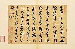
Cursive styles such as Xíngshū (semi-cursive or running script) and Cǎoshū (cursive or grass script) are less constrained and faster, where more movements made by the writing implement are visible. These styles' stroke orders vary more, sometimes creating radically different forms. They are descended from Clerical script, in the same time as Regular script ( Han Dynasty), but Xíngshū and Cǎoshū were use for personal notes only, and were never used as standard. Caoshu style was highly appreciated in Emperor Wu of Han reign (140-87).
- Printed and computer styles
Examples of modern printed styles are Song from the Song Dynasty's printing press, and sans-serif. These are not considered traditional styles, and are normally not written.
Influences
- Other calligraphies
Japanese and Korean people developed specific sensibilities and styles of calligraphies. By example, Japanese calligraphy go out of the set of CJK strokes to also include local alphabets such as hiragana and katakana, with specific problematics such as new curves and moves. In the case of Korean calligraphy, the Hangeul and the existence of the circle required the creation of a new technique which usually confuses Chinese calligraphers. The existence of temporary calligraphy is also to notice, which is a practice of water-only calligraphy on the floor which, indeed, dry out within minutes. This practice is especially appreciated by the new generation of retired Chinese in public parks of China.
- Other arts
Calligraphy has influenced ink and wash painting, which is accomplished using similar tools and techniques. Calligraphy has influenced most major art styles in East Asia, including Ink and wash painting, a style of Chinese, Korean, Japanese painting, and Vietnamese painting based entirely on calligraphy.
South Asian Calligraphy
Indian calligraphy

On the subject of Indian calligraphy, Anderson 2008 writes:
Aśoka's edicts (c. 265–238 BC) were committed to stone. These inscriptions are stiff and angular in form. Following the Aśoka style of Indic writing, two new calligraphic types appear: Kharoṣṭī and Brāhmī. Kharoṣṭī was used in the northwestern regions of India from the 3rd century BC to the 4th century of the Christian Era, and it was used in Central Asia until the 8th century.
In many parts of ancient India, the inscriptions were carried out in smoke-treated palm leaves. This tradition dates back to over two thousand years . Even after the Indian languages were put on paper in the 13th century, palm leaves where considered a preferred medium of writing owing to its longevity (nearly 400 years) compared to paper. Both sides of the leaves were used for writing. Long rectangular strips were gathered on top of one another, holes were drilled through all the leaves, and the book was held together by string. Books of this manufacture were common to Southeast Asia. The palm leaf was an excellent surface for penwriting, making possible the delicate lettering used in many of the scripts of southern Asia.
Burnt clay and Copper were a favoured material for Indic inscriptions. In the north of India, birch bark was used as a writing surface as early as the 2nd century AD.
Nepalese calligraphy
Nepalese calligraphy has a huge impact on Mahayana and Vajrayana Buddhism. Ranjana script is the primary form of this calligraphy. The script itself and its derivatives (like Lantsa, Phagpa, Kutila) are used in Nepal, Tibet, Bhutan, Leh, Mongolia, coastal China, Japan and Korea to write "Om mane pame om" and other sacred Buddhist texts, mainly those derived from Sanskrit and Pali.
Tibetan calligraphy
Calligraphy is central in Tibetan culture. The script is derived from Indic scripts. The nobles of Tibet, such as the High Lamas and inhabitants of the Potala Palace, were usually capable calligraphers. Tibet has been a centre of Buddhism for several centuries, and that religion places a great deal of significance on written word. This does not provide for a large body of secular pieces, although they do exist (but are usually related in some way to Tibetan Buddhism). Almost all high religious writing involved calligraphy, including letters sent by the Dalai Lama and other religious and secular authority. Calligraphy is particularly evident on their prayer wheels, although this calligraphy was forged rather than scribed, much like Arab and Roman calligraphy is often found on buildings. Although originally done with a reed, Tibetan calligraphers now use chisel tipped pens and markers as well.
Islamic calligraphy
Islamic calligraphy
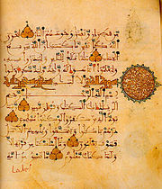
Islamic calligraphy (calligraphy in Arabic is Khatt ul-Yad خط اليد) has evolved alongside the religion of Islam and the Arabic language. As it is based on Arabic letters, some call it "Arabic calligraphy". However the term "Islamic calligraphy" is a more appropriate term as it comprises all works of calligraphy by the Muslim calligraphers from Morocco to China.
Islamic calligraphy is associated with geometric Islamic art ( arabesque) on the walls and ceilings of mosques as well as on the page. Contemporary artists in the Islamic world draw on the heritage of calligraphy to use calligraphic inscriptions or abstractions.
Instead of recalling something related to the spoken word, calligraphy for Muslims is a visible expression of the highest art of all, the art of the spiritual world. Calligraphy has arguably become the most venerated form of Islamic art because it provides a link between the languages of the Muslims with the religion of Islam. The holy book of Islam, al-Qur'an, has played an important role in the development and evolution of the Arabic language, and by extension, calligraphy in the Arabic alphabet. Proverbs and passages from the Qur'an are still sources for Islamic calligraphy.
It is generally accepted that Islamic calligraphy excelled during the Ottoman era. Turkish calligraphers still present the most refined and creative works.Istanbul is an open exhibition hall for all kinds and varieties of calligraphy, from inscriptions in mosques to fountains, schools, houses, etc.
Persian calligraphy

Persian calligraphy is the calligraphy of Persian writing system. The history of calligraphy in Persia dates back to the pre-Islam era. In Zoroastrianism beautiful and clear writings were always praised.
- History and evolution
It is believed that ancient Persian script was invented by about 600-500 BC to provide monument inscriptions for the Achaemenid kings. These scripts consisted of horizontal, vertical, and diagonal nail-shape letters and that is the reason in Persian it is called "Script of Nails" (Khat-e-Mikhi). Centuries later, other scripts such as " Pahlavi" and " Avestan" scripts were used in ancient Persia.
After the Arab conquest in the 7th century, Persians adapted the Arabic alphabet to fit the Persian language and developed a contemporary Persian alphabet. The Arabic alphabet has 28 characters to which Iranians added another four letters for it to fit the sounds and letters of the Persian language that do not exist in Arabic.
- Contemporary scripts
"Nasta'liq" is the most popular contemporary style among classical Persian calligraphy scripts and Persian calligraphers call it "Bride of the Calligraphy Scripts". This calligraphy style has been based on such a strong structure that it has changed very little since. Mir Ali Tabrizi had found the optimum composition of the letters and graphical rules so it has just been fine-tuned during the past seven centuries. It has very strict rules for graphical shape of the letters and for combination of the letters, words, and composition of the whole calligraphy piece.
Other isolated calligraphies
Mayan Glyphs
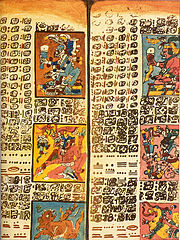
Mayan calligraphy was expressed via Mayan hieroglyphs; modern Mayan calligraphy is mainly used on seals and monuments in the Yucatán Peninsula in Mexico. Mayan hieroglyphs are rarely used in government offices, however in Campeche, Yucatán and Quintana Roo, Mayan calligraphy is written in Latin letters. Some commercial companies in Southern Mexico use Mayan hieroglyphs as symbols of their business. Some community associations and modern Mayan brotherhoods use Mayan hieroglyphs as symbols of their groups.
Most of the archaeological sites in Mexico such as Chichen Itza, Labna, Uxmal, Edzna, Calakmul, etc. have glyphs in their structures. Stone carved monuments also known as stele are a common source of ancient Mayan calligraphy.


